Selected work · Colgate-Palmolive · Electric toothbrush and water flosser
Red, white,
and room to breathe.
A product shoot and two landing pages for Colgate-Palmolive's electric toothbrush and water flosser in India. The pages had to sell. The shoot had to make a toothbrush worth looking at.
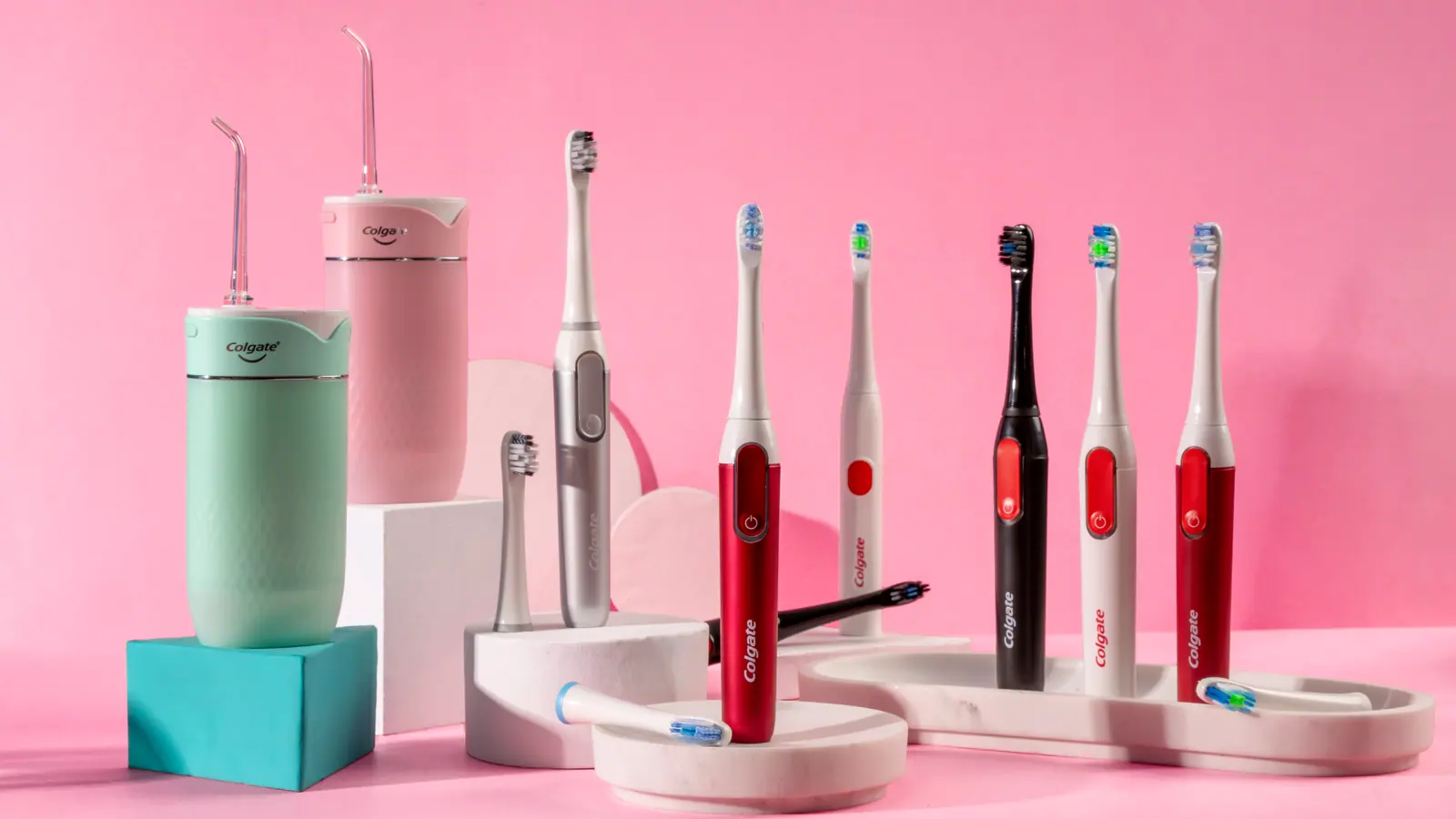
The shoot
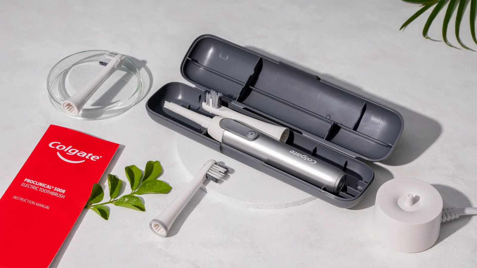
Pastel sets, white plinths, red from the product.
Colgate is a red and white brand, so the shoot never uses a red backdrop. The sets are soft tints, pink, mint, lilac, sand, with white plinths and marble to lift each product. The only red in most frames is the product itself, or a single prop such as a manual or a bottle. The flosser gets water, river stones and a leaf instead of studio props, so it reads as wellness rather than a gadget. Everything is shot in sharp focus with one soft source, so shadows ground the products without reflecting them.


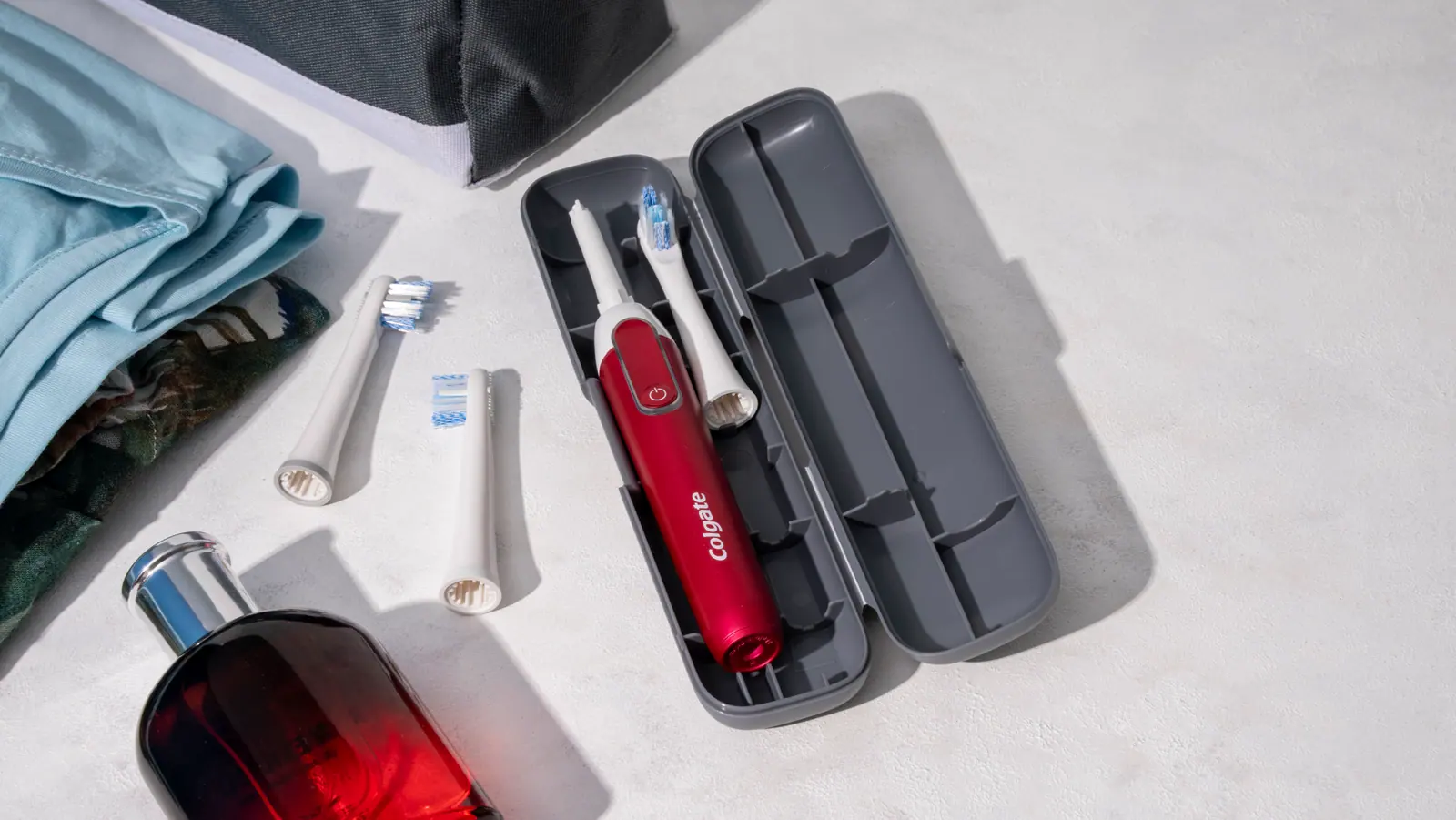

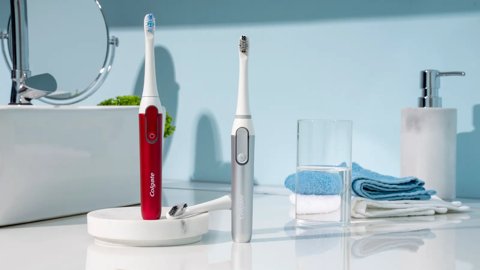
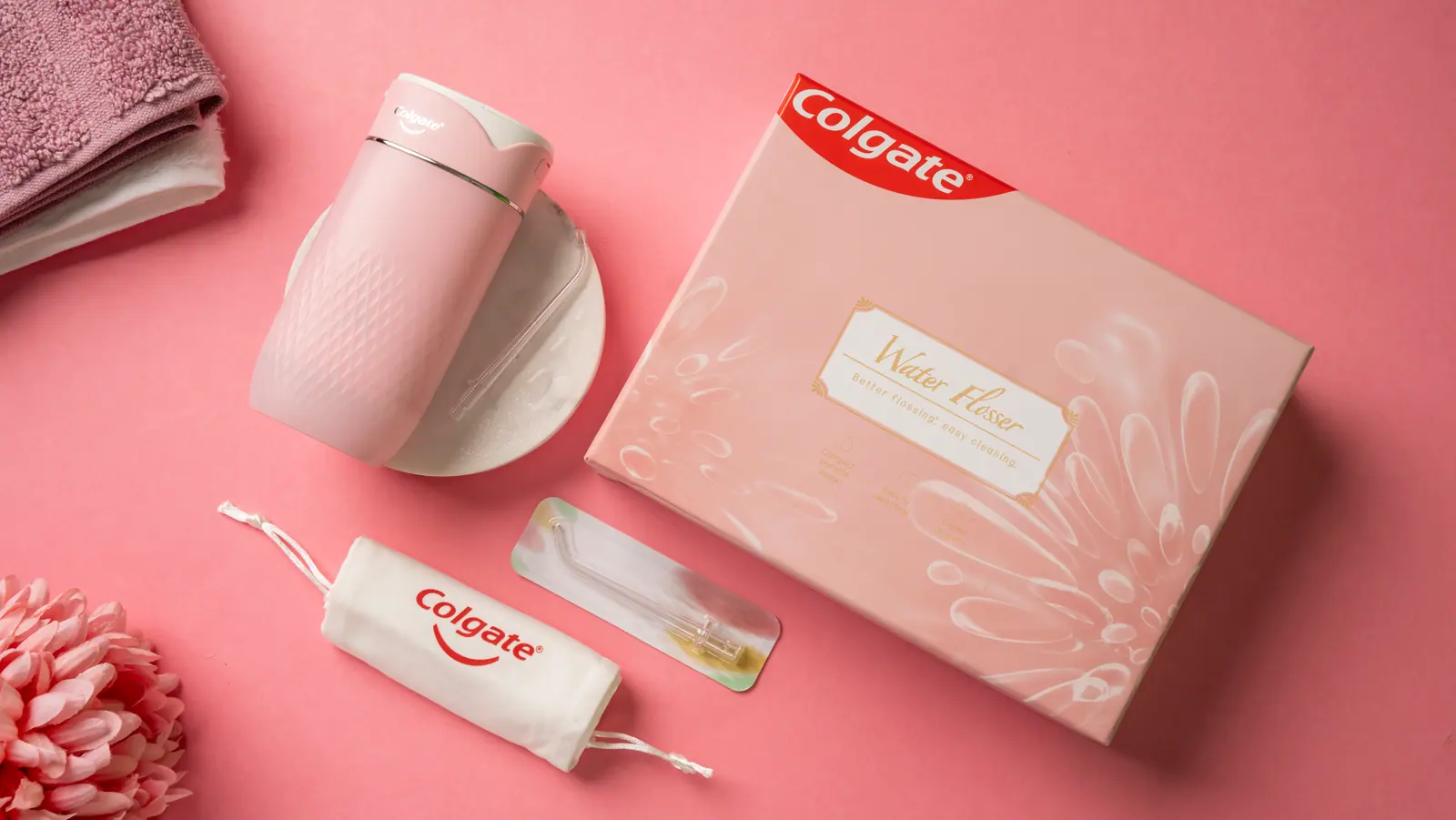

The landing pages
Two products, one page structure.
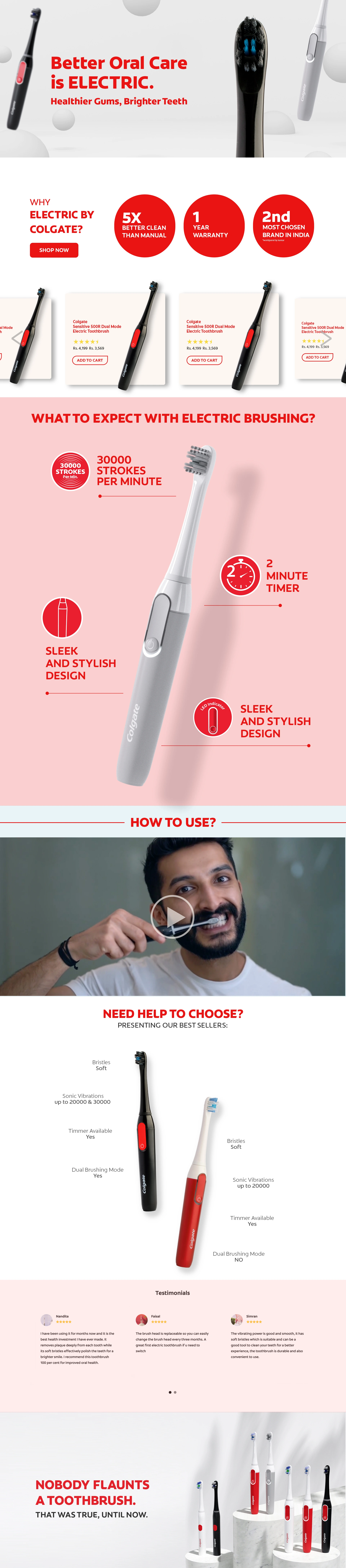
Both pages follow the same order: a hero from the shoot, three reasons to buy, the products with prices, what to expect, a how-to film, help to choose, reviews and a sign-off. The toothbrush page stays on white and the red tint; the flosser page adds mint so its two colours read as a range. Red is kept for headlines, icons and buttons, never for a whole background. Scroll each page.

Red where it counts.
Headlines, proof discs and buttons are Colgate Red. Sections sit on a 15% red tint or a teal tint, so the pages feel red and white without a red wall anywhere.
The shoot leads every section.
Hero, features and sign-off all use frames from the shoot rather than renders. The product is always the largest, brightest thing on screen.
One skeleton, two skins.
Same section order and components for both products. Only the colour, the copy and the photographs change, so the range feels like one family.
My role
From the set to the page.
- Photography stylingSet colours, surfaces, props and product arrangement for all twelve frames.
- Landing pagesDesigned both pages: section order, colour blocking, feature callouts, product cards and the sign-off lines.