Selected work · Everhope Oncology · Doctor referral brochure
Less hospital.
More hope.
Everhope Oncology runs day-care cancer centres in Gurgaon built to feel less like a hospital. This brochure goes to ENT specialists and asks them to refer patients. It had to carry Everhope's warmth into something a doctor reads in two minutes between appointments.
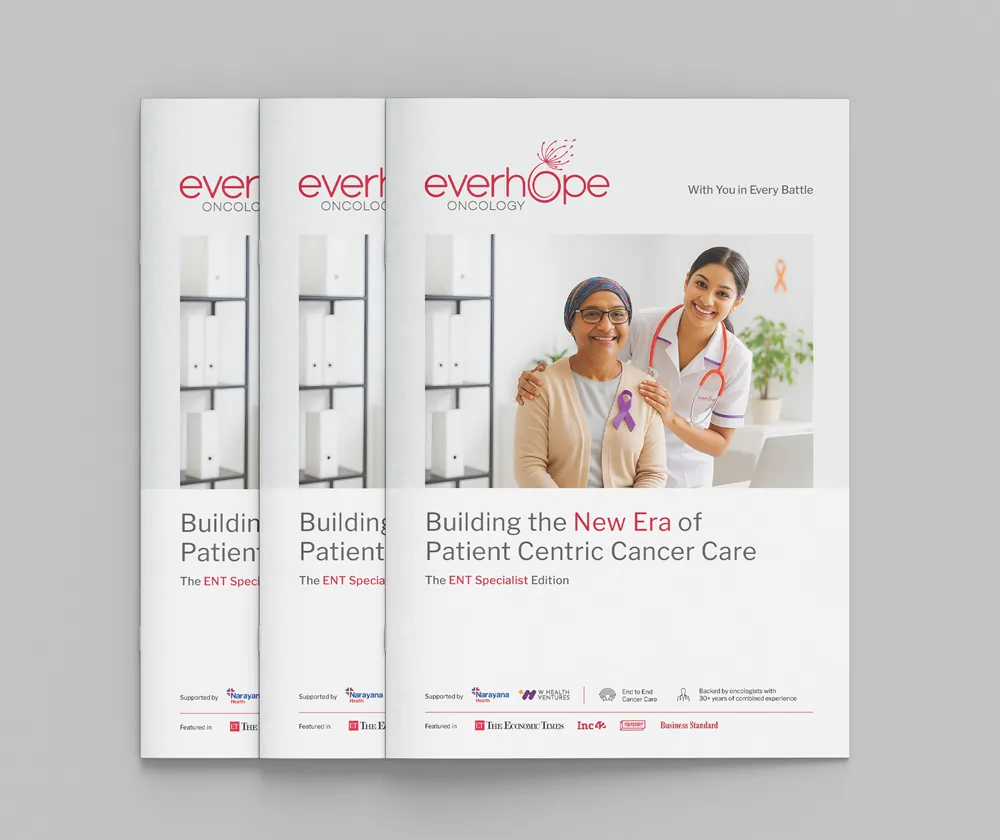
The brochure
Eight pages, in the order a doctor asks.
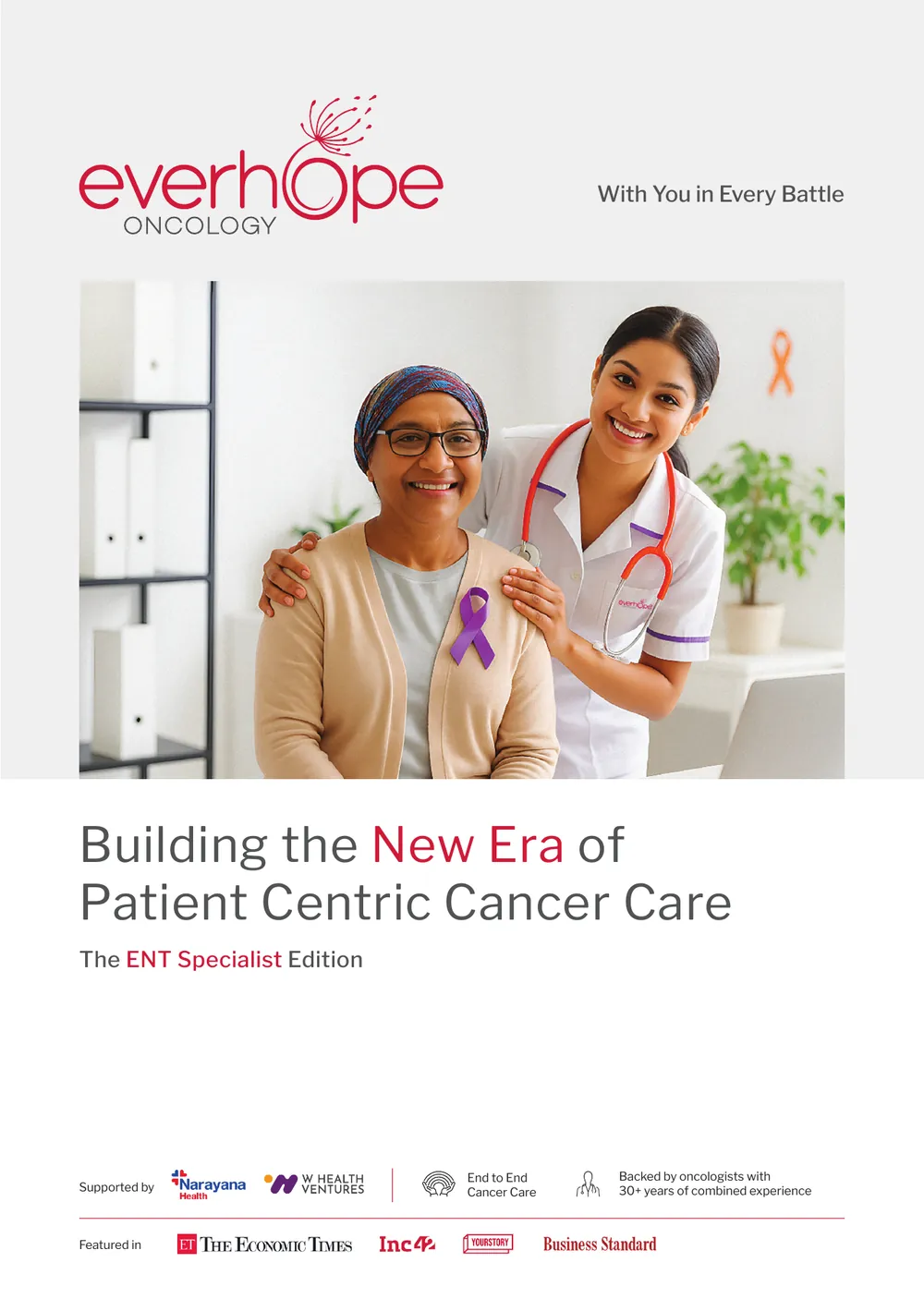
What is Everhope, what makes it different, when to refer and what gets treated, what the partnership looks like, what the centre feels like. Each panel carries one idea on a soft grey ground with white cards for the detail, and every spread ends on a photograph of a person or a room, never a procedure. Click any page to enlarge.
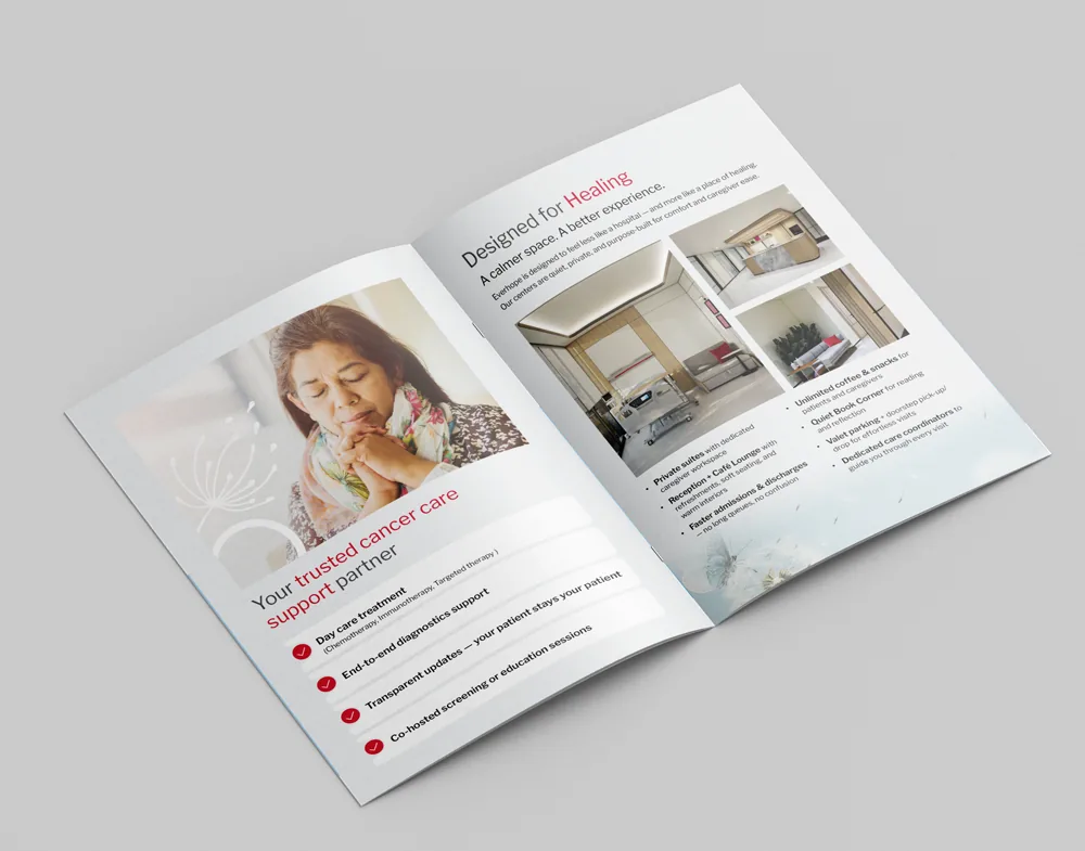
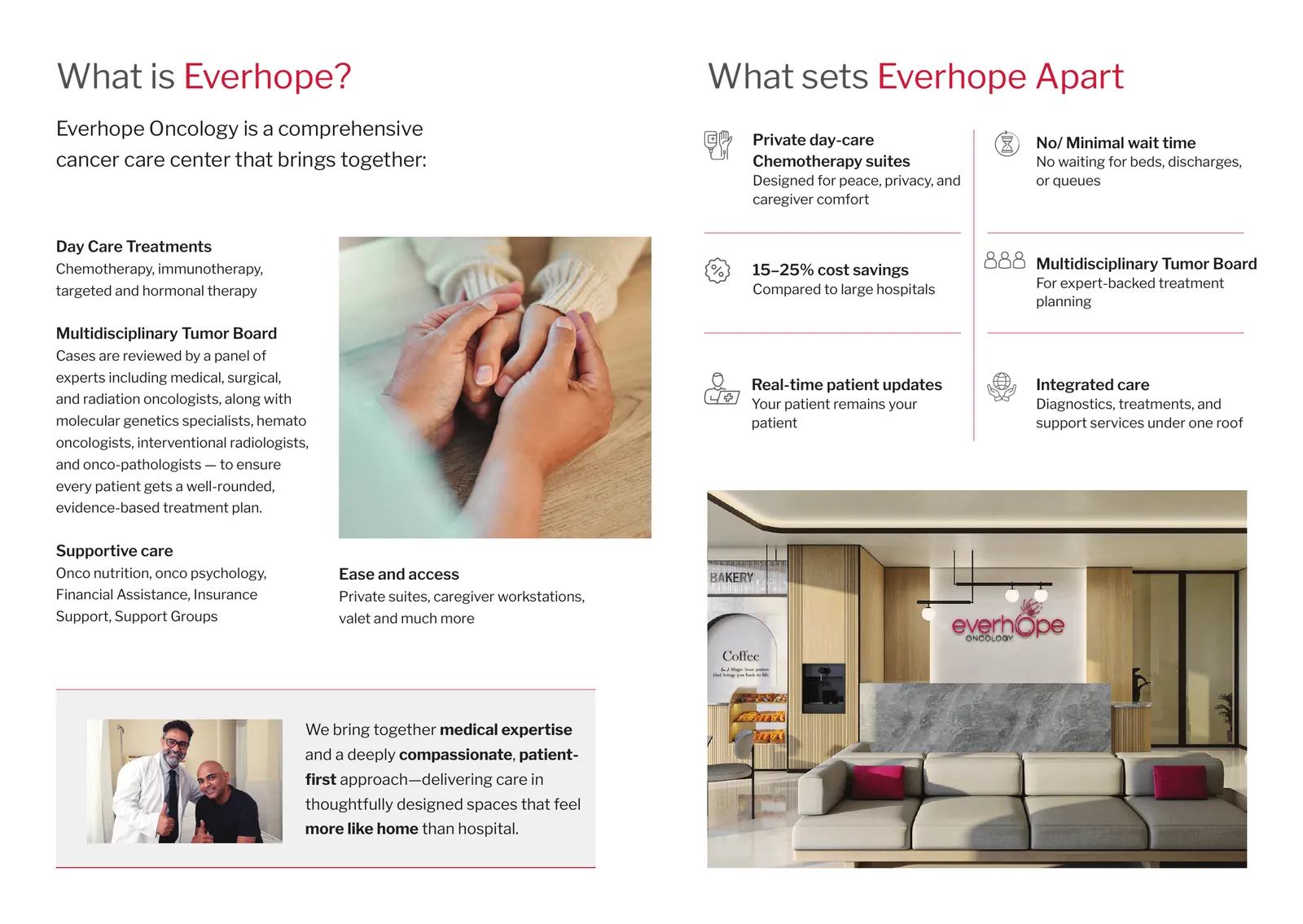
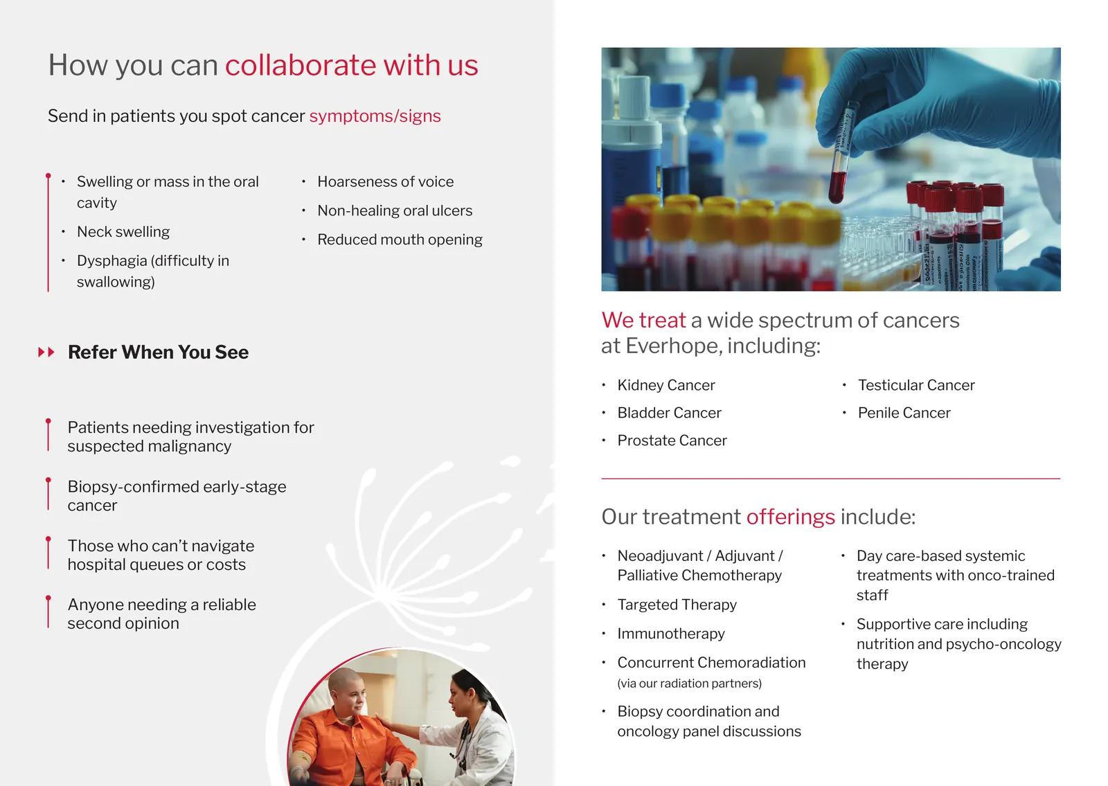
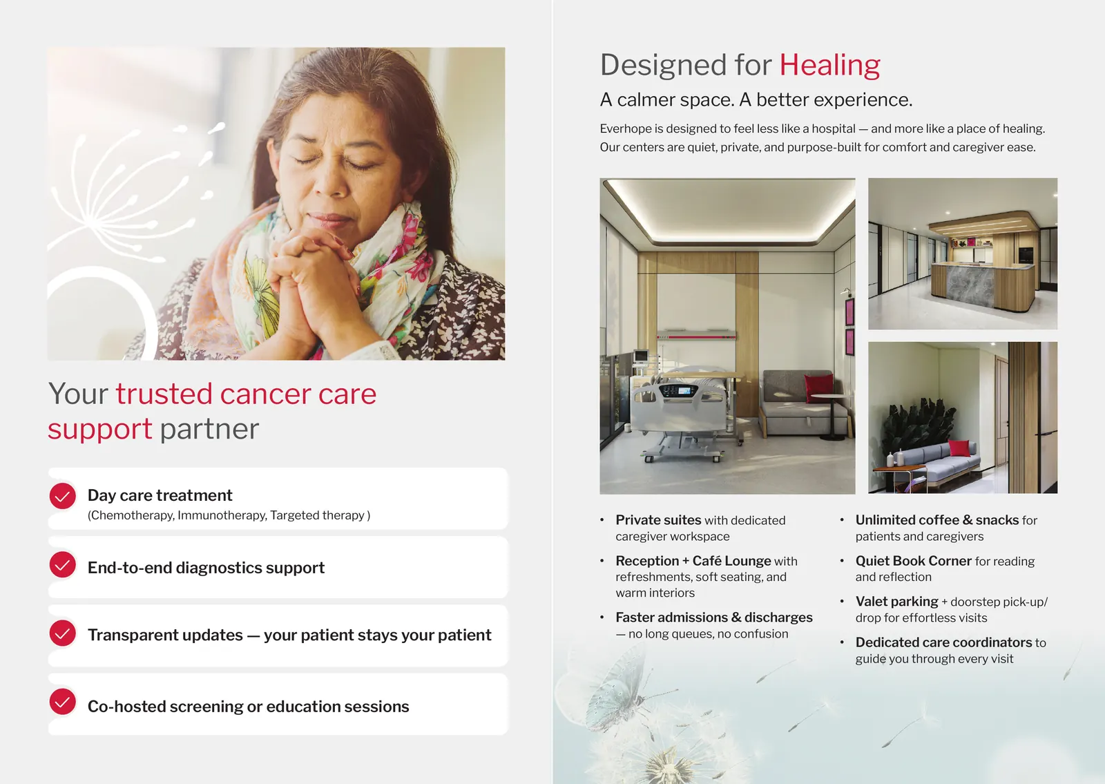
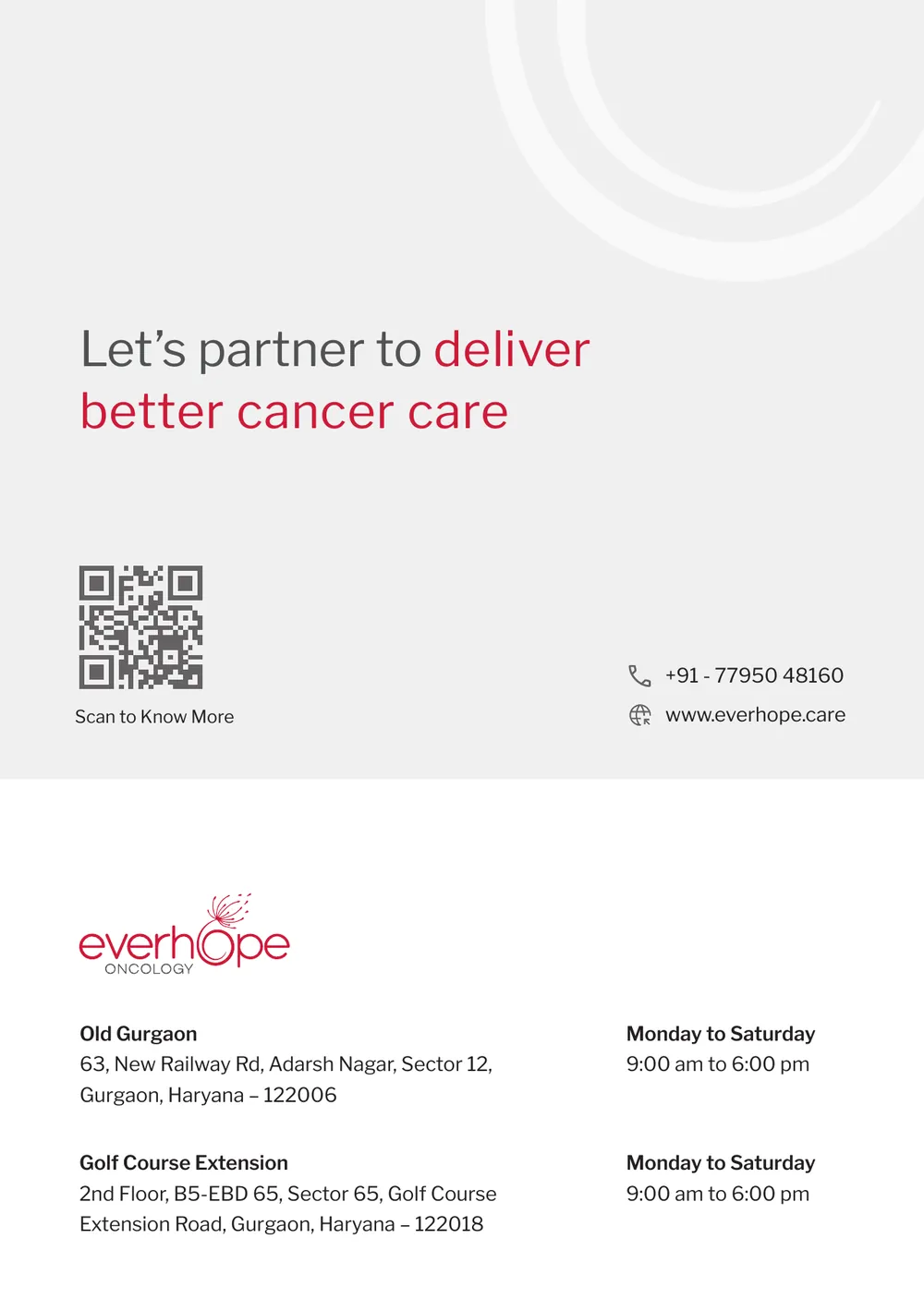
The back cover is the ask. One line, a QR code, a phone number, both centres with their hours. Nothing a doctor has to hunt for.
The identity, applied
One red, one typeface, one mark.
I built Everhope's identity around a single colour, a single typeface and a dandelion. The brochure uses all three and adds nothing. Here is how each part shows up on the page.
Cardinal red, held to accents.
Cardinal red is Everhope's core colour, but a doctor's brochure can't shout. It lives in one phrase per headline, the ticks, the checks and the icon accents. Cadet grey carries the panels, white carries the cards. The orange and green from the wider palette stay in the drawer.
Libre Franklin, quiet at size.
Everhope's typeface, used at every level. Headlines are set Regular at large sizes so they read as calm rather than loud; one phrase in red does the emphasis. Labels are SemiBold, body is Regular, and nothing is in caps.
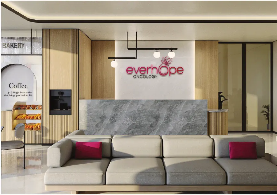
People being cared for. Rooms built for comfort.
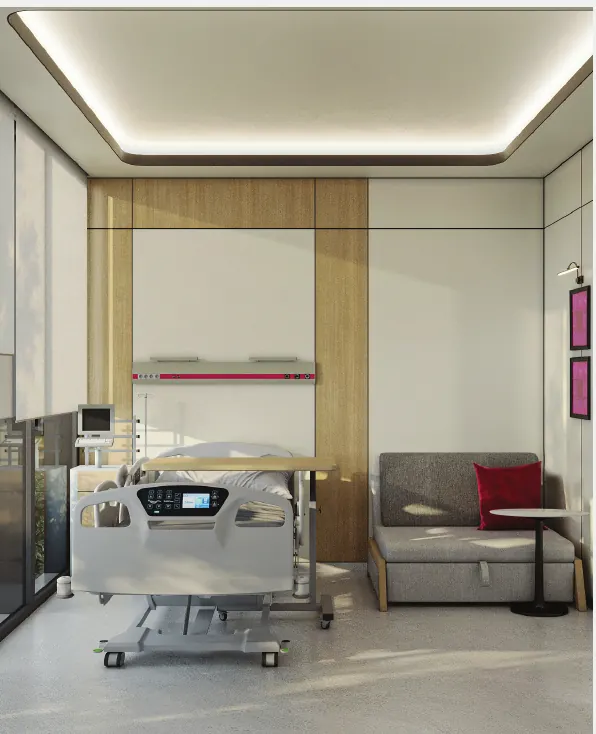
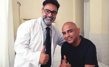
Warm light, natural expressions, a hand held, a nurse's arm on a shoulder, and the centre's own interiors with their red cushions. No needles, no procedures, no white corridors. The photography direction is also the argument the brochure makes.




Three decisions
What made it Everhope.
Red in phrases, not walls.
A page can read as Everhope from across a desk without a red panel anywhere. One red phrase per headline, red ticks, red checks. The rest of the page stays grey and white so the doctor's eye goes to the words.
Grey panels, white cards.
Soft grey backgrounds with white content cards mirror the centres themselves: quiet, private, uncluttered. One idea per panel, a photograph to close each spread, and the same skeleton for every edition.
Built to change one panel.
This is the ENT specialist edition. For another specialty only the symptoms to refer on and the cancers treated change; the cover line, the offer and the centre pages stay. One design, many doctors.
My role.
- Identity systemColour, typeface, the dandelion mark and the photography direction that every Everhope piece follows.
- Print designLayout and typographic hierarchy, the three list devices, image selection and cropping, print-ready artwork and the mockups.