Weight Loss
Made Easy
Brochure for ElevateNow’s medical weight loss programme, handed to patients by partner doctors. It explains why diets fail, what the programme does instead, and what the first months look like.
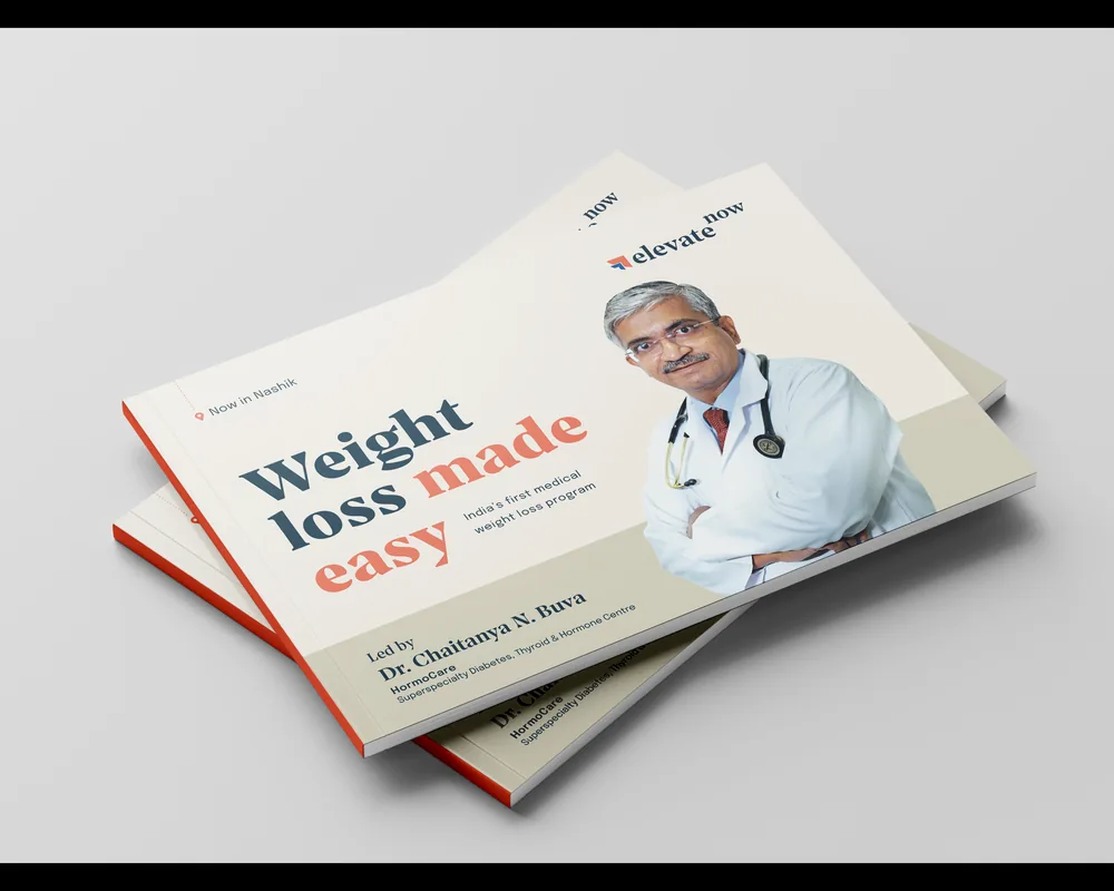
Eight pages, in the order a patient asks
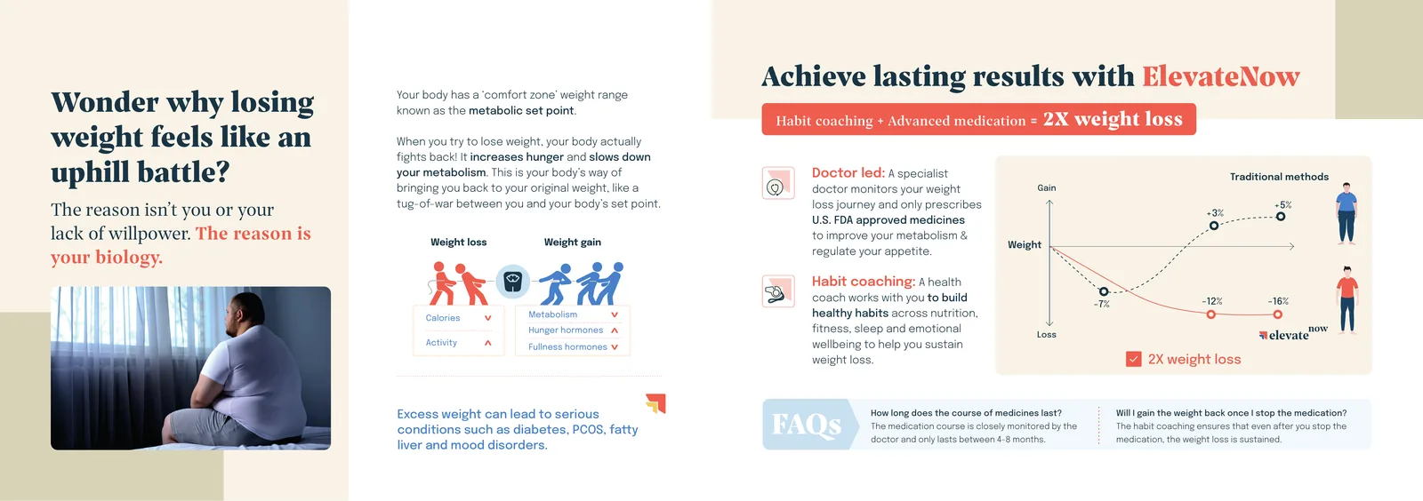
Why does the weight come back? What does ElevateNow do differently? What happens in the first twelve weeks? How long does it take?
Click any page to enlarge.
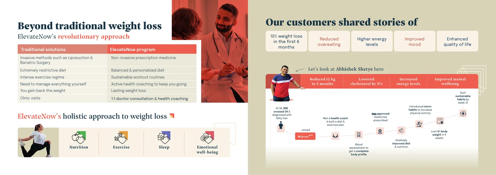
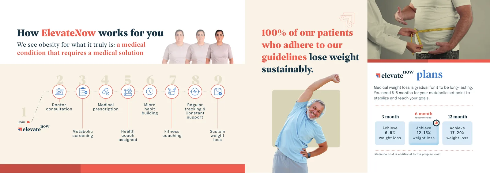
The identity
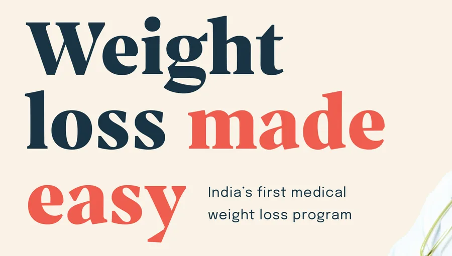
I built ElevateNow’s identity around Prospectus, Epilogue and Burnt Sienna on cream. The brochure carries all three, plus the figures, icons and infographics drawn for it.
Colour
Burnt Sienna only for the words that matter. Cream carries the pages, and a sand band anchors each spread.
Typography
Prospectus for the headlines: a bold serif that sounds like an authority and still feels warm, with one phrase in Burnt Sienna. Epilogue for everything else: a plain sans with nine weights that stays legible in the FAQs, the table and the nine-step timeline.
Illustration
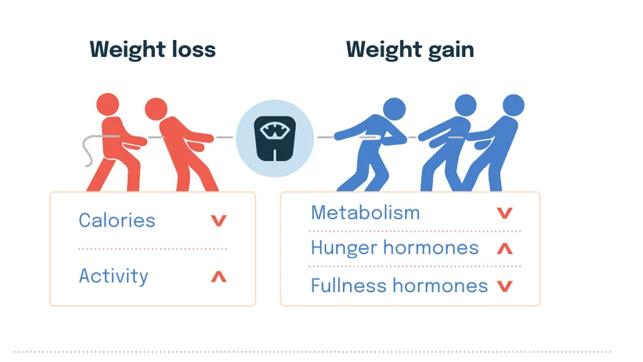
People retain and understand visuals better, which is why every visual is meaningfully crafted to reach the target audience.
What made it ElevateNow
Colour
One coral phrase per headline, and nowhere else in the body text. The pages stay cream so the diagrams carry the colour.
Hierarchy
Diagram before detail. Every spread opens with a picture of the idea, and the paragraphs explain what the picture already showed.
Editions
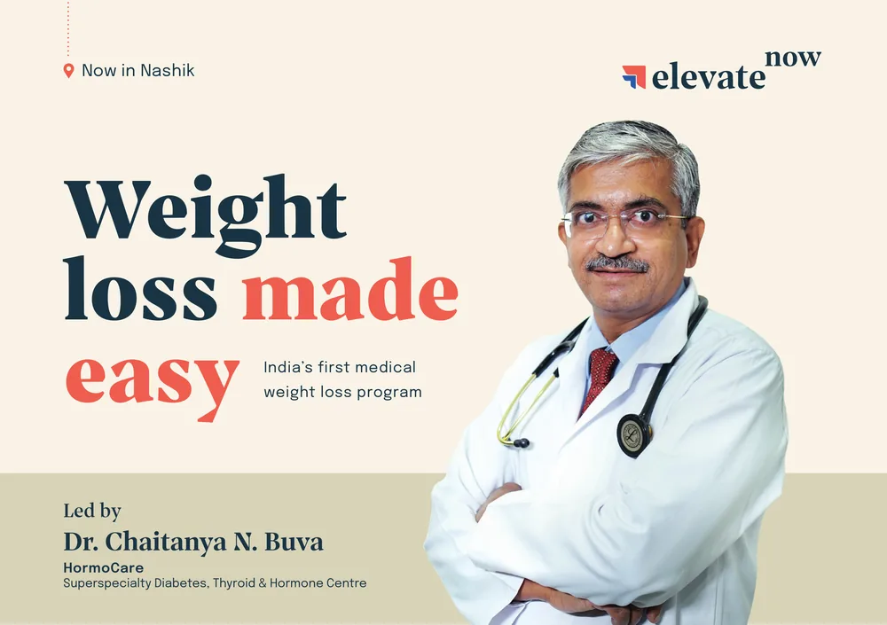
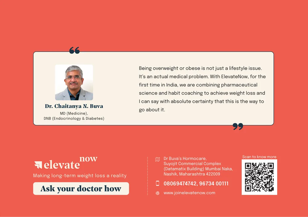
One brochure per partner clinic. The cover, the doctor’s endorsement and the back cover change; the six inside pages stay the same. This is the Nashik edition.