Care Begins Before
the Consultation
A person in pain shouldn’t have to work out where to go, what to fill in, or what happens next. Every surface a patient meets at a Nivaan clinic, from the sign outside to the handout they take home, was designed so they feel expected, understood and looked after. Built for women over 45 and men over 50, then re-issued for 16+ clinics in 9+ cities.
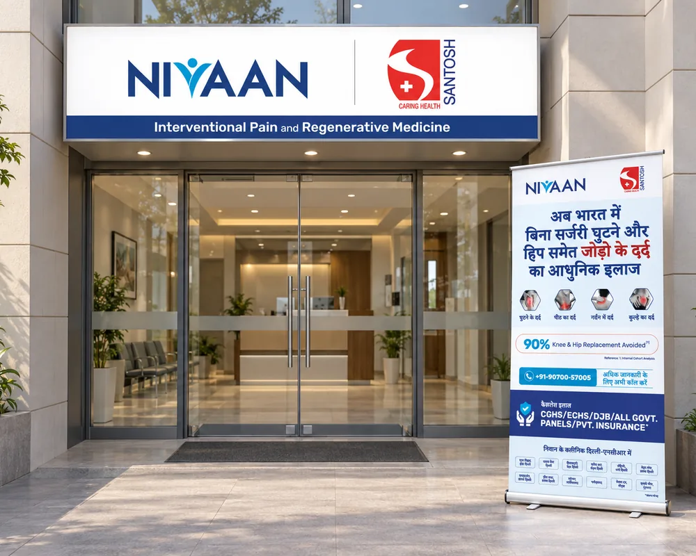
Am I in the right place?
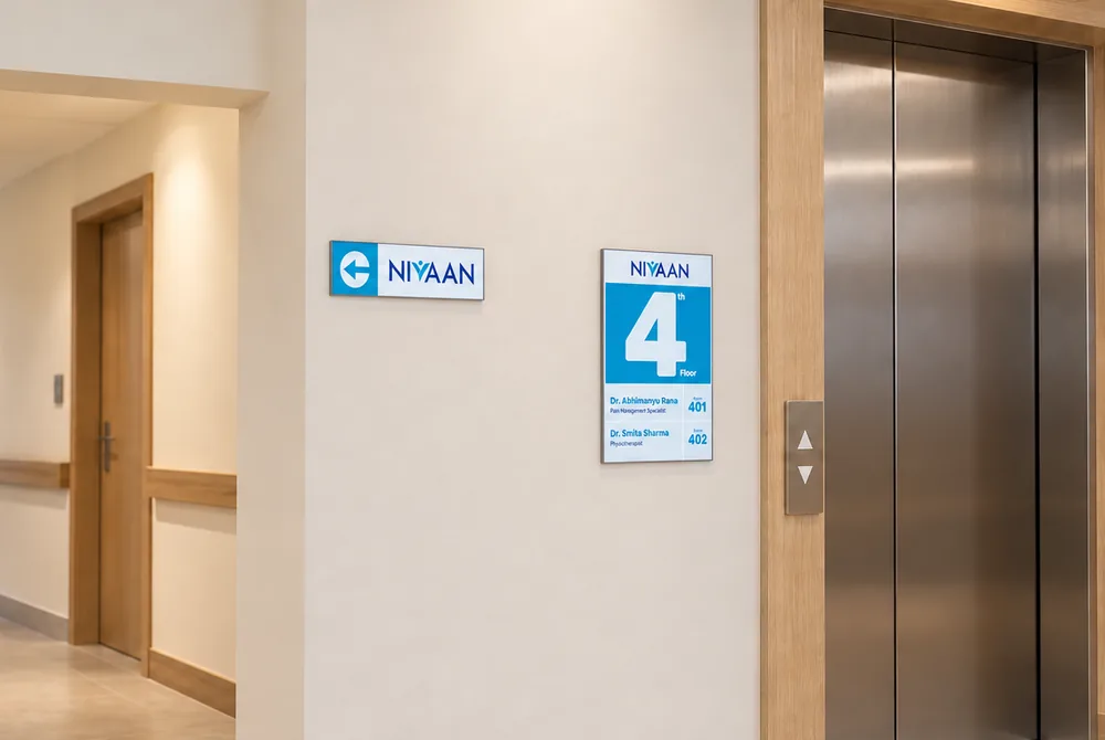
Being lost in a hospital is its own kind of pain, so the first thing the clinic does is reassure. The LED board puts Nivaan beside the host hospital’s name, the standee at the gate says it again in Hindi, and inside, an arrow at the lift and a floor directory take the patient to the right door without having to ask anyone. They arrive already feeling expected.
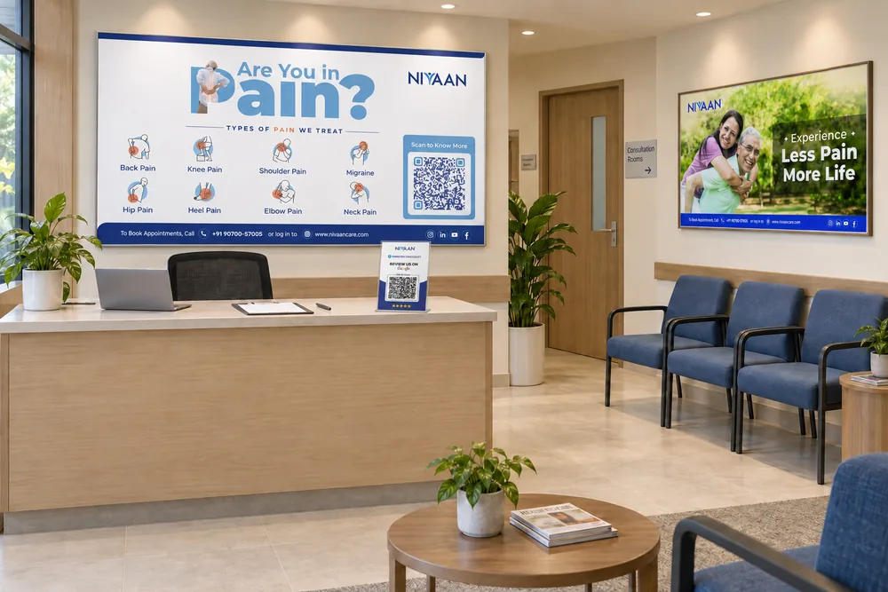
Do they treat my kind of pain?
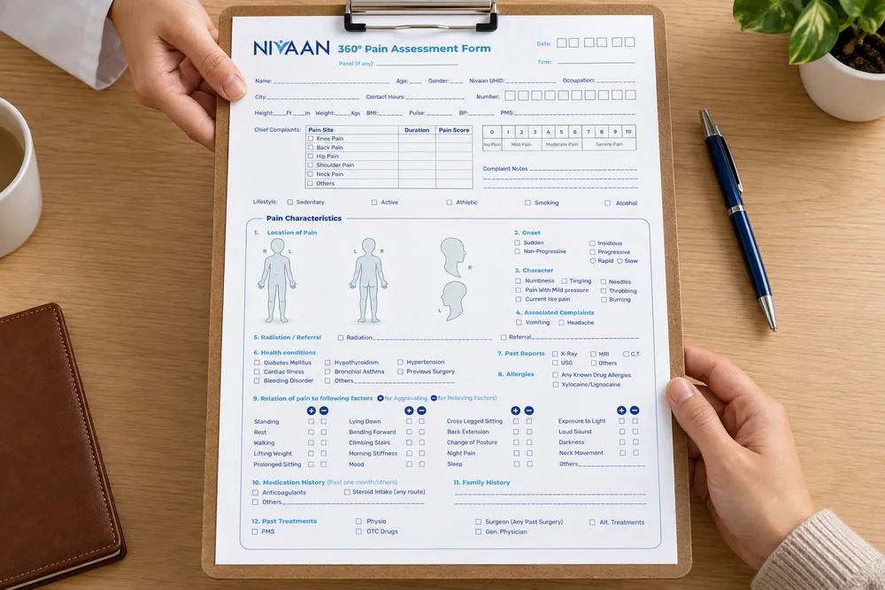
“Are You in Pain?” at the care manager’s desk turns eight pain areas into icons, so a patient can point to what hurts before they have to explain it. The 360° assessment fits on one page, and the patient file stays with them through the visit, so nobody asks the same question twice. While they wait, two posters show the life after the visit, not the pain that brought them in.
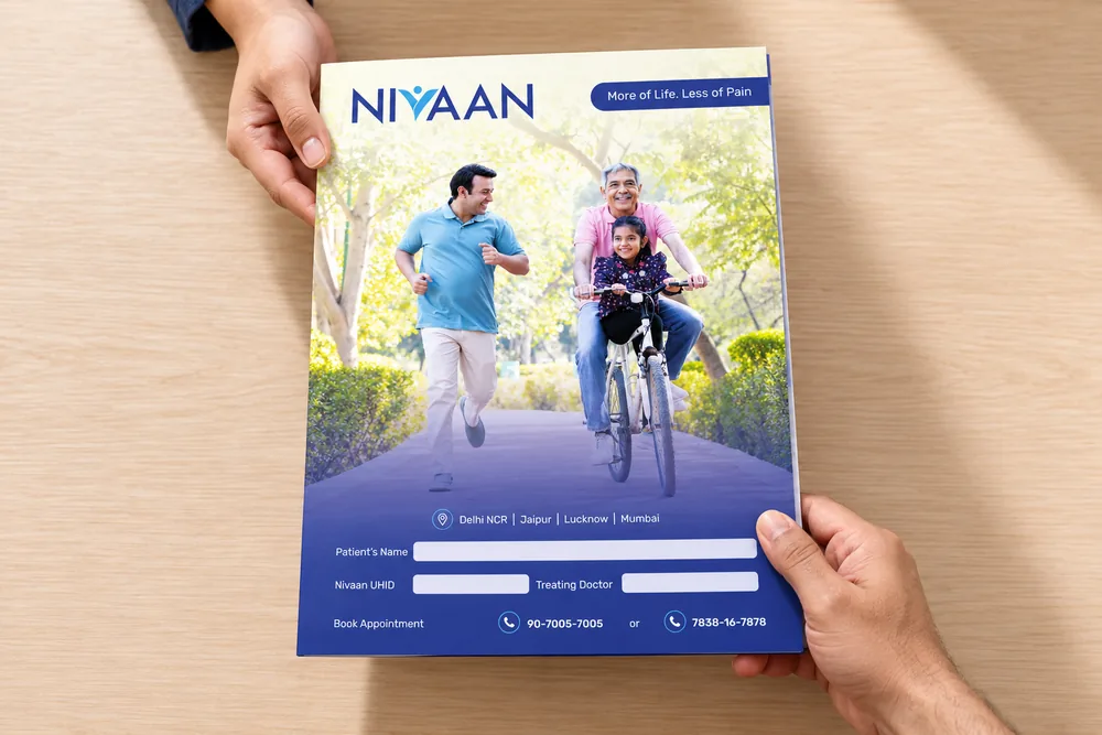
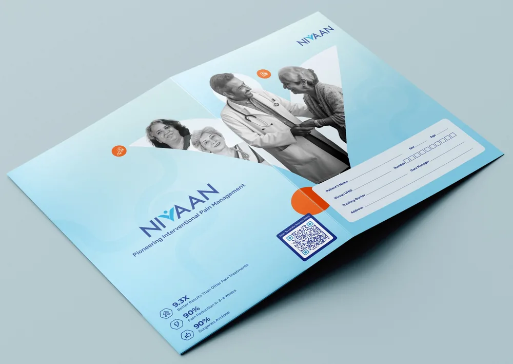
The patient file that didn’t make it. My favourite of the two: the arc holds the people, the back carries the proof, and the details panel sits inside the fold. The clinic chose the other one.
Which way is in?
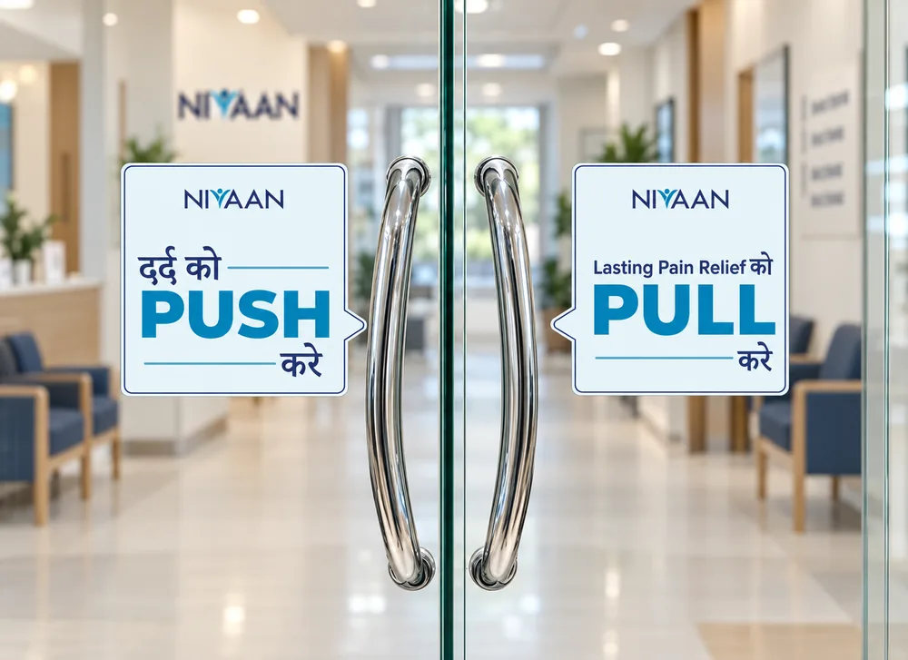
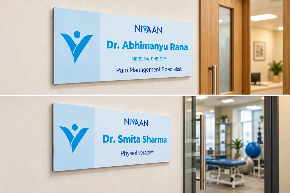
Small frustrations add up when you’re hurting. Push and pull, in Hindi and English, make the last step obvious, and the nameplate confirms the person behind the door, so the patient walks in knowing who they’re about to meet.
How does my care fit together?
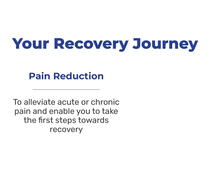
“Your Recovery Journey” gives the doctor and the patient one picture to talk over: pain reduction, rehabilitation, lifestyle. Nobody is left to guess what comes next. The second poster says why Nivaan exists, so the patient knows this is a place built for their kind of pain.
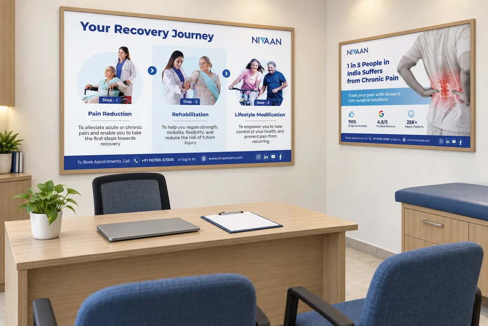
What will recovery ask of me?
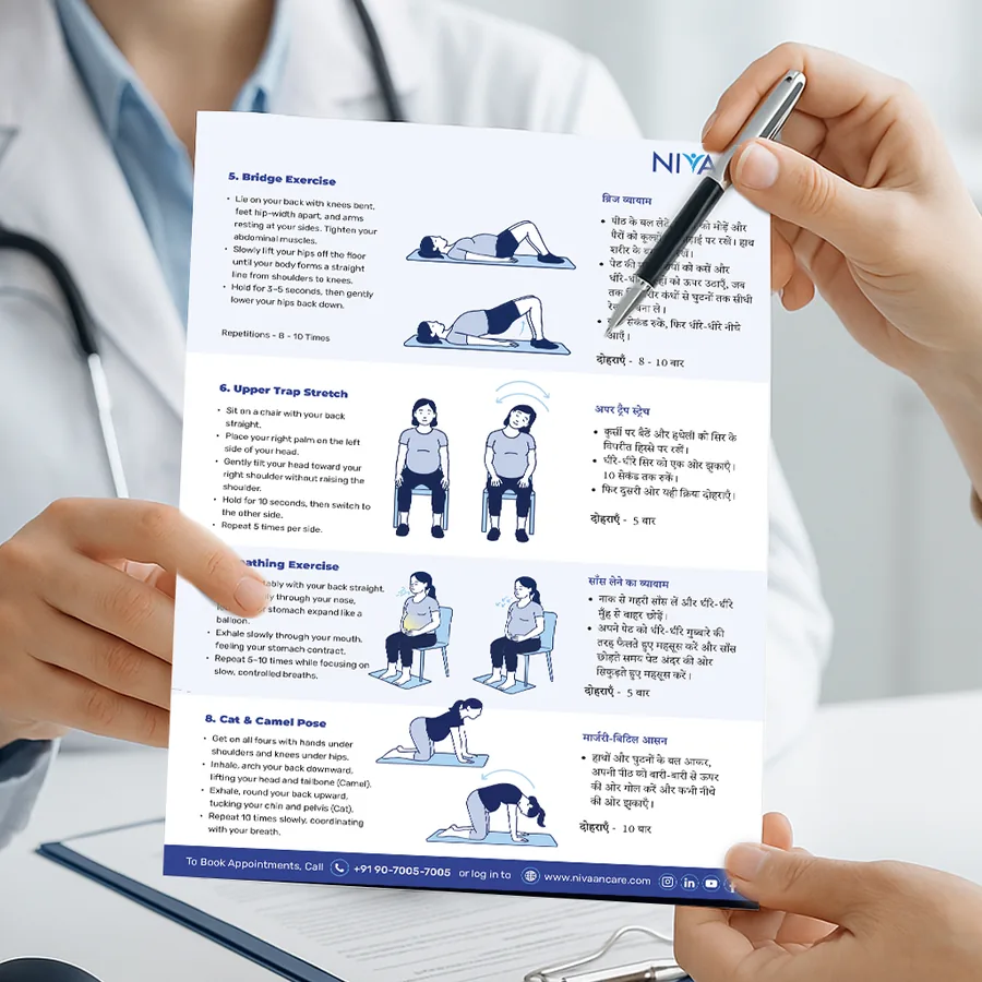
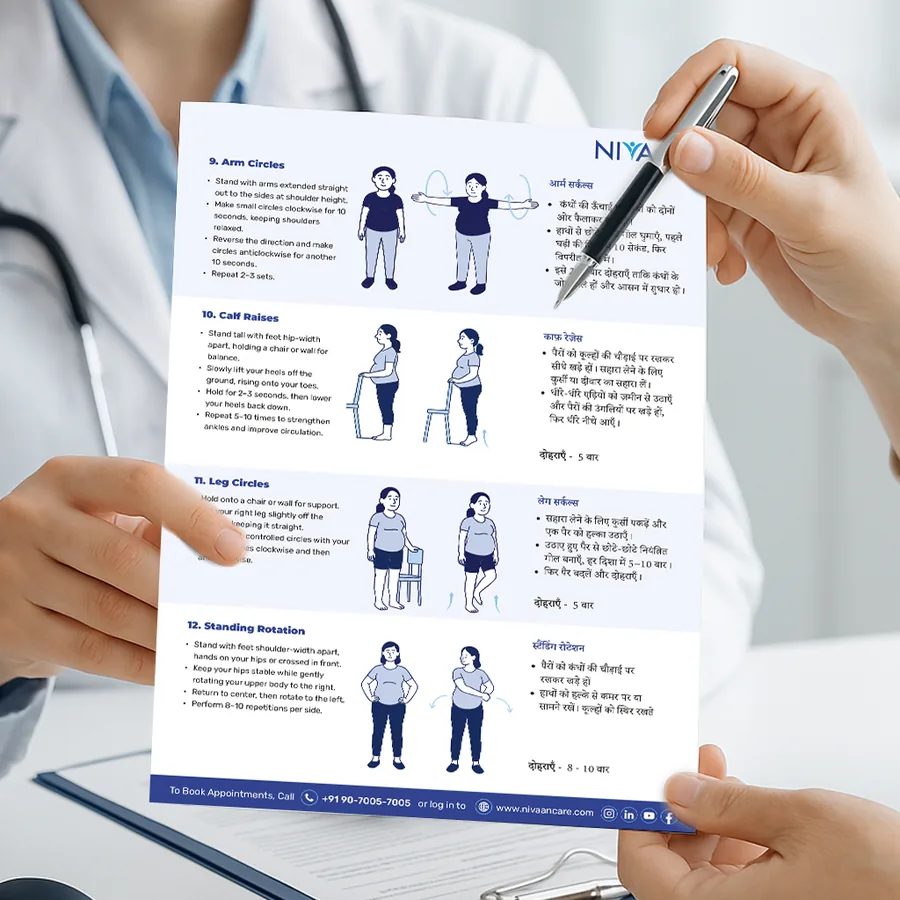
Recovery asks for effort, and effort is easier when you can see the plan. The physio room shows the path through recovery, what physiotherapy does, which treatments, and a home workout, illustrated and bilingual, so the patient leaves knowing what to do, not just what was done to them.
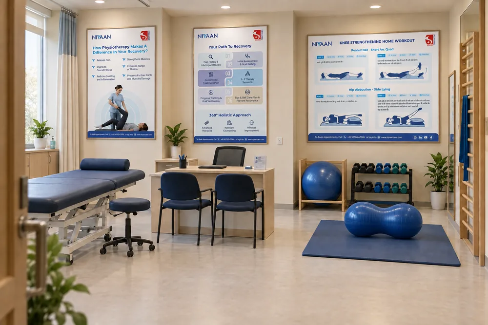
How was my visit?
Back at the care manager’s desk, a tabletop asks the patient to review the clinic on Google. It belongs at the end of the visit, when there is an experience to reflect on, and it sits on the same desk where the visit began. The loop closes where it opened, and the clinic says, in print, that it wants to hear how it went.
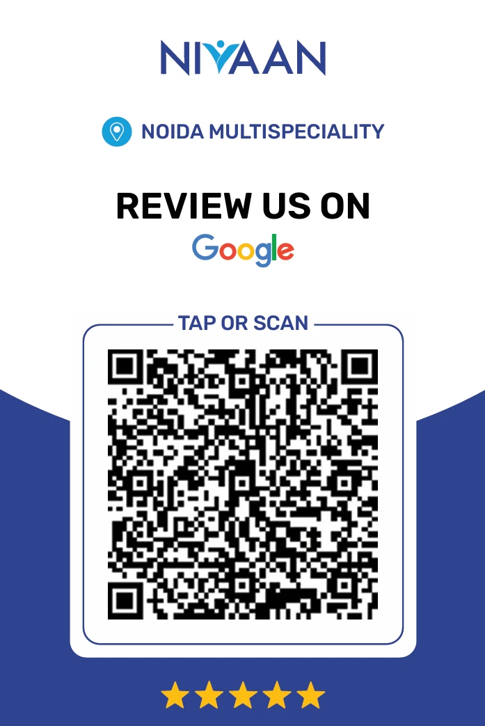
What do I take home?
The care doesn’t stop at the door. Condition brochures and exercise handouts in the same family go home with the patient, one colour per condition, the same reading order in every fold, so at the kitchen table a week later, the clinic’s voice is still there.
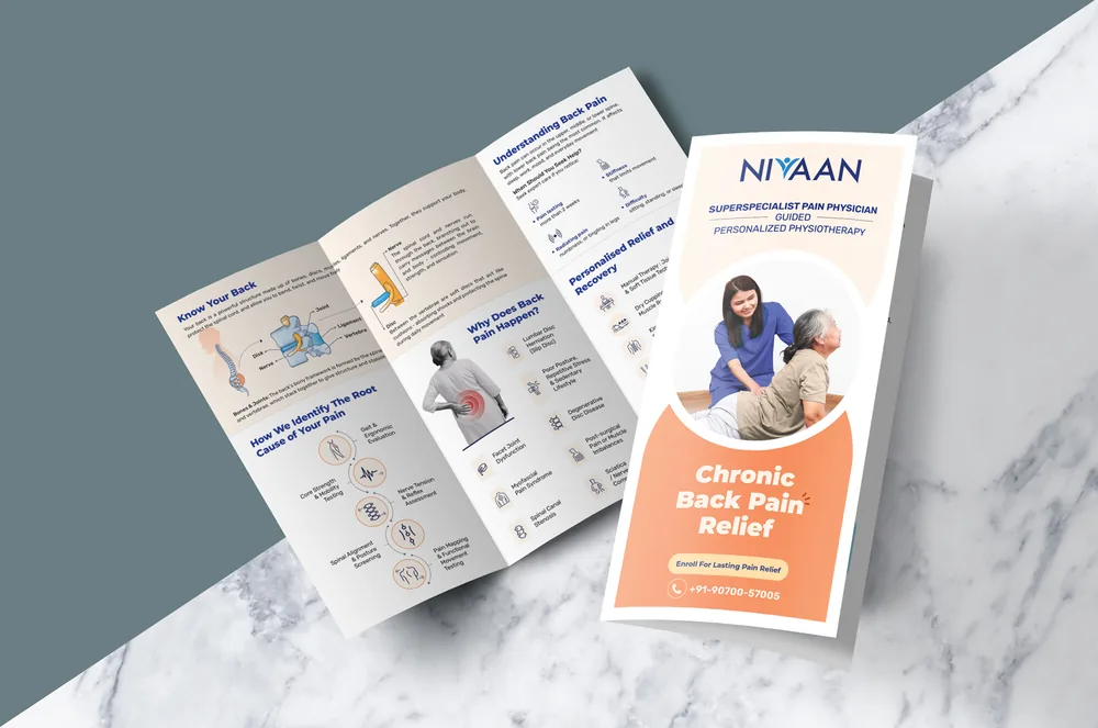
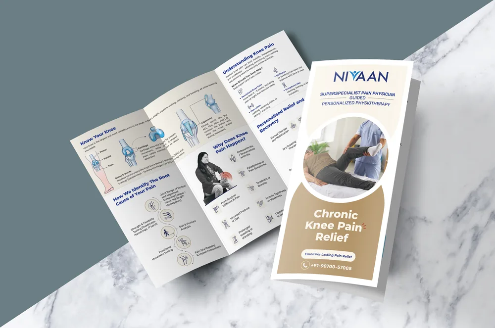
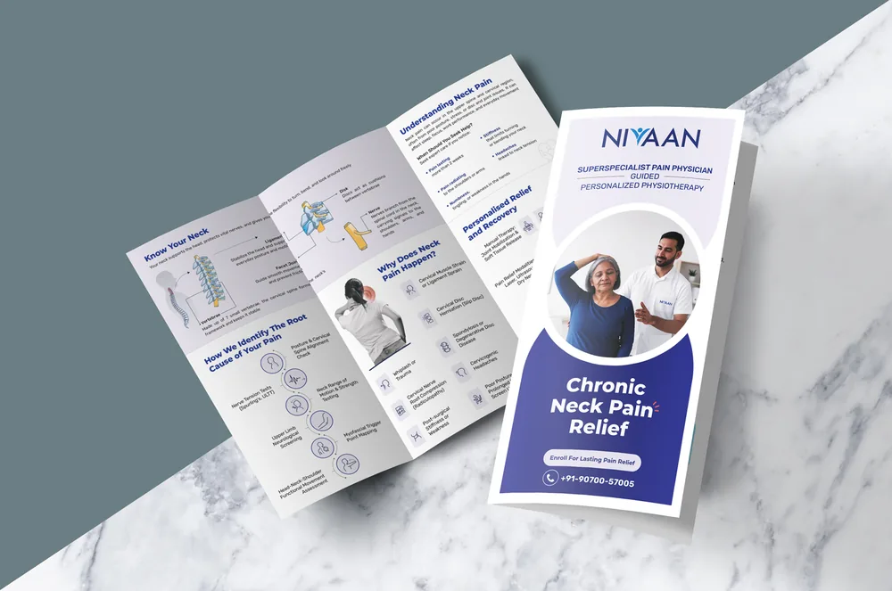
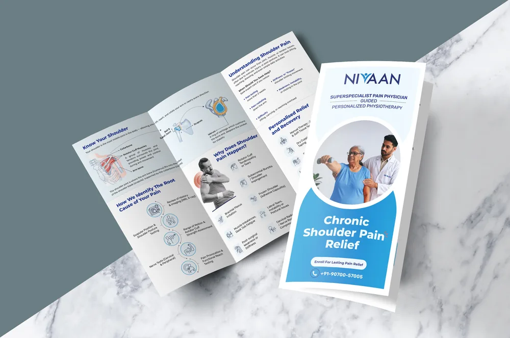
Designed to feel cared for
Nivaan’s brand archetype is the Sage: the calm, knowing guide. The person all of this is for is a woman over 45 or a man over 50, often reading while in pain, standing in a corridor, sometimes without their glasses. Feeling cared for starts with being able to read: big type, one message per surface, Hindi wherever the reading has to be quick, and people in the pictures who look like them.
Typography
A Sage brand has to sound like a caregiver, not a salesman. Montserrat for the headlines: wide, geometric and calm, so a title still reads from across the waiting room. Rubik for everything else: soft corners and open shapes that stay easy on tired eyes at brochure size. Together they read as guidance, not instruction.
Photography · the patient
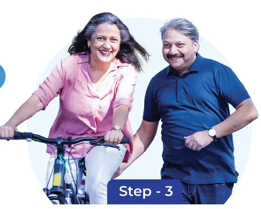
Women over 45 and men over 50, shown after the visit, not before it: laughing, cycling, back in their lives. The patient sees who they can be again, not what they are today.
Photography · the care
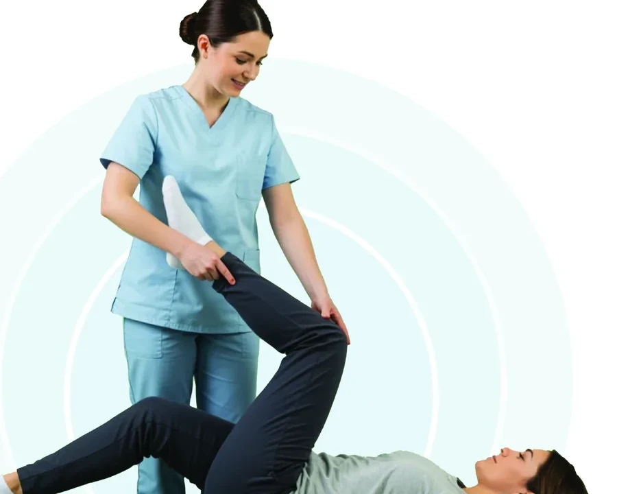
Where a clinician appears, they are hands-on with the patient. Care is shown as something done with you, not to you, so the room reads as a place where people are helped, not processed.
One system, 16+ clinics
Scale is part of the care. A patient should be looked after the same way whichever Nivaan they walk into, so the system was built once and made easy to re-issue.
Recognition across locations
Nivaan’s logo, blue palette and repeated visual cues connect the outside sign, interior graphics and take-home print.
Hierarchy for the viewing moment
The exterior needs quick recognition. Posters introduce a small number of messages. Brochures and handouts accommodate closer, more deliberate reading.
Language that meets the audience
Hindi appears at the entrance and on door graphics; English and Hindi sit together in the exercise guidance. The language choices change with the touchpoint.
Communication alongside the team
The care manager registers and assists. The clinician explains care. The physiotherapist guides movement. The artwork provides a visible reference alongside those conversations.
Continuity after the visit
The printed family connects the clinic’s identity to practical information that patients can take away.
Paper, material and vendors
I chose the brochure stock on value for money and had it matt-laminated so it feels premium in a patient’s hands, chose the material for the OPD banners and boards, and managed the vendors who printed and installed the work.